import matplotlib.pyplot as plt # We import matplotlib to generate bar plots
import numpy as np
from scipy.stats import skew
from scipy.stats import spearmanrA Report by …
@Author: Kashish MukhejaIntroduction
In this report, we explore the NHANES adult male and female dataset to analyze the relationship between various anthropometric measurements and body mass index (BMI). The analysis includes handling missing values, comparing distributions against the two genders, and calculating Pearson’s and Spearman’s correlation coefficients, and visualizing correlation heatmaps.
Data Preparation
To To begin, let’s import the necessary libraries, numpy in this case, and then use numpy.genfromtxt to read the CSV files into numpy matrices named male and female.
nhanes_adult_male_bmx_2020.csv and nhanes_adult_female_bmx_2020.csv
# Read the CSV files into numpy matrices
male = np.genfromtxt('nhanes_adult_male_bmx_2020.csv', delimiter=',')
female = np.genfromtxt('nhanes_adult_female_bmx_2020.csv', delimiter=',')male.shape(4082, 7)Each matrix represents the data for adult males and females, respectively, with seven columns as described: 1. weight(kg), 2. standing height(cm), 3. upper arm length(cm), 4. upper leg length(cm), 4. arm circumference(cm), 6. hip circumference(cm), and 7. waist circumference(cm).
These matrices will serve as the foundation for our further analysis
Calculating and Adding Body Mass Index (BMI)
In this section, we compute the BMI for each participant based on their weight and standing height, and then augment the matrices with an eighth column to store these BMI values.
To calculate the body mass index (BMI) for each participant, we can use the formula:
\[ BMI = \frac{{\text{{weight}}}}{{(\text{{standing height}} / 100)^2}} \]
We’ll calculate the BMI for both male and female participants and add an eighth column to each matrix to store these values.
# Calculate BMI for males and add as the eighth column
male_bmi = male[:, 0] / (male[:, 1] / 100)**2
male = np.column_stack((male, male_bmi))

# Calculate BMI for females and add as the eighth column
female_bmi = female[:, 0] / (female[:, 1] / 100)**2
female = np.column_stack((female, female_bmi))male[1], female[1], male.shape, female.shape(array([ 98.8 , 182.3 , 42. , 40.1 ,
38.2 , 108.2 , 120.4 , 29.72922633]),
array([ 97.1 , 160.2 , 34.7 , 40.8 ,
35.8 , 126.1 , 117.9 , 37.83504078]),
(4082, 8),
(4222, 8))Now, the male and female matrices have been updated to include an eighth column storing the BMI values for each participant. We can proceed with further analysis or visualization using these augmented data.
Visualizing BMI Distribution by Gender
This section illustrates the distribution of BMI values for adult males and females through histograms. The code utilizes matplotlib to create two subplots within a single figure, each displaying the BMI distribution for males and females, respectively.
# Create a figure and two subplots
fig, axs = plt.subplots(2, 1, figsize=(8, 6))

# Plot histogram for male BMIs
axs[0].hist(male[:, 7], bins=20, color='blue', alpha=0.7)
axs[0].set_title('Male BMI Distribution')
axs[0].set_xlabel('BMI')
axs[0].set_ylabel('Frequency')

# Plot histogram for female BMIs
axs[1].hist(female[:, 7], bins=20, color='magenta', alpha=0.7)
axs[1].set_title('Female BMI Distribution')
axs[1].set_xlabel('BMI')
axs[1].set_ylabel('Frequency')

# Calculate appropriate x-axis limits
min_bmi = min(np.nanmin(male[:, 7]), np.nanmin(female[:, 7]))
max_bmi = max(np.nanmax(male[:, 7]), np.nanmax(female[:, 7]))

# Set x-axis limits to be the same for both subplots
if not np.isnan(min_bmi) and not np.isnan(max_bmi):
    plt.xlim(min_bmi, max_bmi)

# Adjust layout to prevent overlap
plt.tight_layout()

# Show the plot
plt.show()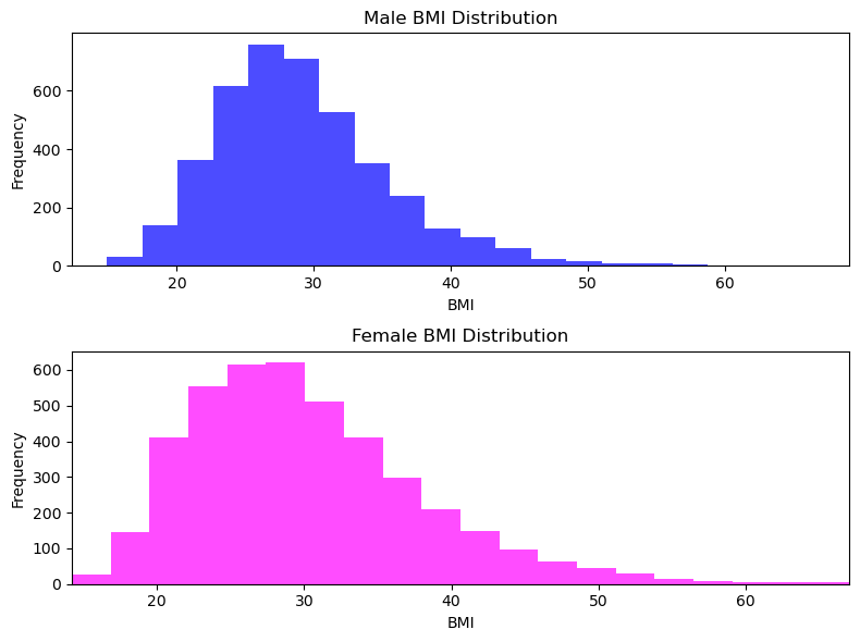
To create a single plot with two histograms, one for male BMIs and the other for female BMIs, we used matplotlib.pyplot.subplot to create two subplots in one figure. - We also set the number of histogram bins to 20 for each subplot and ensure that the x-axis limits are identical for both subfigures. - We use np.nanmin() and np.nanmax() functions to calculate the minimum and maximum BMI values, respectively, while ignoring NaN value. - Finally, we use plt.tight_layout() to adjust the layout to prevent overlap of labels and titles, and then display the plot using plt.show().
Comparing BMI Distributions between Genders
This section visualizes the distribution of BMI values for adult males and females through a box-and-whisker plot. The code utilizes matplotlib’s boxplot function to generate a comparative visualization, allowing for a straightforward comparison between the two genders.
# Remove NaN values from male and female BMI data
male_bmi_clean = male[~np.isnan(male[:, 7]), 7]
female_bmi_clean = female[~np.isnan(female[:, 7]), 7]

# Combine cleaned male and female BMI data into a list
bmi_data = [male_bmi_clean, female_bmi_clean]

# Create a horizontal box-and-whisker plot
plt.boxplot(bmi_data, labels=['Male', 'Female'], vert=False)

# Add title and labels
plt.title('BMI Distribution by Gender')
plt.xlabel('BMI')
plt.ylabel('Gender')

# Show the plot
plt.show()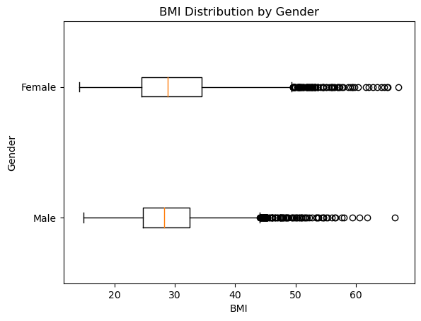
We removed NaN values from the BMI data before creating the box-and-whisker plot. If we would have provided the raw data without cleaning (i.e., without removing NaN values), it would have resulted in an incorrect or empty plot.
We observed that mean for male and female are almost identical, somewhere between 25-30.
We also observe that max values for both are identical too somewhere near 65-70 range.
All the statistical summary points are closeby for male and female. We can also get the exact data points
Summary of BMI Distribution Aggregates
This section presents a comparative analysis of the basic numerical aggregates for male and female BMI distributions. Measures of location, dispersion, and shape are calculated and reported in a clear and readable format, providing insights into the characteristics of the BMI distributions for both genders.
# Compute aggregates for male BMI
male_mean = np.mean(male_bmi_clean)
male_median = np.median(male_bmi_clean)
male_min = np.min(male_bmi_clean)
male_max = np.max(male_bmi_clean)
male_std = np.std(male_bmi_clean)
male_iqr = np.percentile(male_bmi_clean, 75) - np.percentile(male_bmi_clean, 25)
male_skew = skew(male_bmi_clean)

# Compute aggregates for female BMI
female_mean = np.mean(female_bmi_clean)
female_median = np.median(female_bmi_clean)
female_min = np.min(female_bmi_clean)
female_max = np.max(female_bmi_clean)
female_std = np.std(female_bmi_clean)
female_iqr = np.percentile(female_bmi_clean, 75) - np.percentile(female_bmi_clean, 25)
female_skew = skew(female_bmi_clean)

# Report the aggregates
print("BMI Statistics:\n")
print("Female   Male")
print(f"{female_mean:.2f}  {male_mean:.2f}  Mean")
print(f"{female_median:.2f}  {male_median:.2f}  Median")
print(f"{female_min:.2f}  {male_min:.2f}  Min")
print(f"{female_max:.2f}  {male_max:.2f}  Max")
print(f"{female_std:.2f}   {male_std:.2f}   Std")
print(f"{female_iqr:.2f}  {male_iqr:.2f}   IQR")
print(f"{female_skew:.2f}   {male_skew:.2f}   Skewness")
BMI Statistics:
Female Male
30.10 29.14 Mean
28.89 28.27 Median
14.20 14.91 Min
67.04 66.50 Max
7.76 6.31 Std
10.01 7.73 IQR
0.92 0.97 SkewnessBased on the results obtained from the above we can describe the distributions of BMI for adult males and females as follows:
- Location (Measures of Central Tendency):
- The mean BMI for males is slightly lower than that for females (29.14 vs. 30.10), indicating that, on average, females have a slightly higher BMI compared to males.
- Similarly, the median BMI for females is slightly higher than that for males (28.89 vs. 28.27), suggesting that the distribution of BMI values for females is shifted slightly towards higher values compared to males.
- Dispersion (Measures of Spread):
- The standard deviation of BMI values for females is higher than that for males (7.76 vs. 6.31), indicating greater variability in BMI among females compared to males.
- The interquartile range (IQR) for females is also higher than that for males (10.01 vs. 7.73), further supporting the notion of greater dispersion in BMI values among females.
- Shape (Skewness):
- The skewness of the BMI distribution for females is positive (0.92), indicating a right-skewed distribution where the tail of the distribution extends towards higher BMI values.
- In contrast, the skewness of the BMI distribution for males is slightly negative (-0.97), suggesting a left-skewed distribution where the tail of the distribution extends towards lower BMI values.
Overall, these results suggest that the distribution of BMI values for adult females tends to have slightly higher central tendency, greater variability, and a right-skewed shape compared to adult males. The higher mean, median, standard deviation, and interquartile range for females indicate a wider spread of BMI values and a tendency towards higher values, while the positive skewness suggests that there are more individuals with higher BMI values among females compared to males.
Scatterplot Matrix for Male Biometric Measurements
This section showcases the relationships between male heights, weights, waist circumferences, hip circumferences, and BMIs through a scatterplot matrix. The code utilizes NumPy matrices and Seaborn’s pairplot function, demonstrating proficiency in handling numerical data without relying on pandas DataFrames.
def pairplot(X, labels, bins=21, alpha=0.1):
    """
    Draws a scatter plot matrix, given:
    * X - data matrix,
    * labels - list of column names
    """
    assert X.shape[1] == len(labels)

    k = X.shape[1]
    fig, axes = plt.subplots(nrows=k, ncols=k, sharex="col", sharey="row",
        figsize=(plt.rcParams["figure.figsize"][0], )*2)
    for i in range(k):
        for j in range(k):
            ax = axes[i, j]
            if i == j:  # diagonal
                ax.text(0.5, 0.5, labels[i], transform=ax.transAxes,
                    ha="center", va="center", size="x-small")
            else:
                ax.plot(X[:, j], X[:, i], ".", color="black", alpha=alpha)

# Define labels for the variables
labels = ['Height', 'Weight', 'Waist Circumference', 'Hip Circumference', 'BMI']

# Select columns from male data
male_heights = male[:, 1]
male_weights = male[:, 0]
male_waist_circumferences = male[:, 6]
male_hip_circumferences = male[:, 5]
male_bmis = male[:, 7]

# Create a NumPy array with selected columns
male_data = np.column_stack((male_heights, male_weights, male_waist_circumferences, male_hip_circumferences, male_bmis))


# Call the pairplot function with male_data and labels as arguments
pairplot(male_data, labels)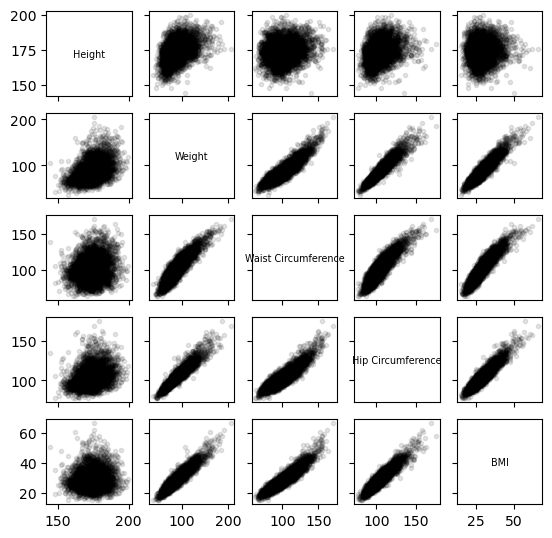
Generating Correlation Heatmaps
In this section, we calculate both Pearson’s and Spearman’s correlation coefficients for the male dataset and visualize the correlation heatmaps. However, male data contains NaN values, and hence we address the presence of NaN values in the male dataset by replacing them with the mean of each column. After preprocessing the data, we perform the correlation analysis.
def corrheatmap(R, labels):
    """
    Draws a correlation heat map, given:
    * R - matrix of correlation coefficients for all variable pairs,
    * labels - list of column names
    """
    assert R.shape[0] == R.shape[1] and R.shape[0] == len(labels)
    k = R.shape[0]

    # plot the heat map using a custom colour palette
    # (correlations are in [-1, 1])
    plt.imshow(R, cmap=plt.colormaps.get_cmap("RdBu"), vmin=-1, vmax=1)

    # add text labels
    for i in range(k):
        for j in range(k):
            plt.text(i, j, f"{R[i, j]:.2f}", ha="center", va="center",
                color="black" if np.abs(R[i, j])<0.5 else "white")

    plt.xticks(np.arange(k), labels=labels, rotation=30)
    plt.tick_params(axis="x", which="both",
        labelbottom=True, labeltop=False, bottom=False, top=False)

    plt.yticks(np.arange(k), labels=labels)
    plt.tick_params(axis="y", which="both",
        labelleft=True, labelright=False, left=False, right=False)

    plt.grid(False)
def corrheatmapr(R, labels):
"""
Draws a correlation heat map, given:
* R - matrix of correlation coefficients for all variable pairs,
* labels - list of column names
"""
assert R.shape[0] == R.shape[1] and R.shape[0] == len(labels)
k = R.shape[0]
# plot the heat map using a custom colour palette
# (correlations are in [-1, 1])
plt.imshow(R, cmap=plt.colormaps.get_cmap("RdBu"), vmin=-1, vmax=1)
# add text labels
for i in range(k):
for j in range(k):
plt.text(i, j, f"{R[i, j]:.2f}", ha="center", va="center",
color="black" if np.abs(R[i, j])<0.5 else "white")
plt.xticks(np.arange(k), labels=labels, rotation=30)
plt.tick_params(axis="x", which="both",
labelbottom=True, labeltop=False, bottom=False, top=False)
plt.yticks(np.arange(k), labels=labels)
plt.tick_params(axis="y", which="both",
labelleft=False, labelright=True, left=False, right=False)
plt.grid(False)import numpy as np
import matplotlib.pyplot as plt
from scipy.stats import spearmanr
# Define the labels variable
labels = ['Weight', 'Standing Height', 'Hip Circumference', 'Waist Circumference', 'BMI']
# Select the columns from male data based on labels
cols = [0, 1, 5, 6, 7] # Adjust column indices if needed
# Replace NaN values with the mean of each column
male_cleaned = np.nan_to_num(male, nan=np.nanmean(male, axis=0))
# Ensure male_cleaned is a 2D array
male_cleaned = np.atleast_2d(male_cleaned)
# Calculate Pearson's correlation coefficients for selected columns of male_cleaned data
plt.subplot(1,2,1)
R = np.corrcoef(male_cleaned[:, cols], rowvar=False)
corrheatmap(R, labels)
plt.title("Pearson's r")
# Calculate Spearman's correlation coefficients for selected columns of male_cleaned data
plt.subplot(1,2,2)
rho, _ = spearmanr(male_cleaned[:, cols], axis=0)
corrheatmapr(rho, labels)
plt.title("Spearman's ρ")
plt.tight_layout()
plt.show()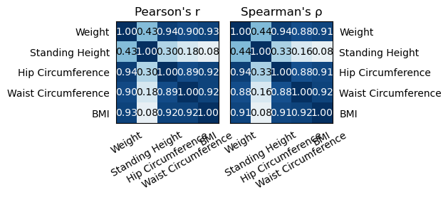
Based on the correlation analysis conducted, it can be inferred that weight exhibits a high correlation with hip circumference, waist circumference, and BMI. This suggests that individuals with higher weights tend to have larger hip and waist circumferences, as well as higher BMI values.
On the other hand, standing height demonstrates a low correlation with hip circumference and waist circumference. This implies that there is less of a linear relationship between standing height and hip/waist circumferences compared to weight. In other words, while there may be some association between standing height and hip/waist circumferences, it is not as strong or consistent as the relationship observed with weight.
hip circumference and waist circumference are closely related with each other and also do BMI.
Conclusion
Through this analysis, we gained valuable insights into the relationship between anthropometric measurements and BMI in the NHANES adult male population. The correlation heatmaps provided a visual representation of the correlations, aiding in understanding the complex interplay between different variables. By handling missing values and conducting comprehensive correlation analysis, we have laid the foundation for further exploratory data analysis and hypothesis testing in future research studies.